We are currently running an experiment with a species of turtle ants to determine what biases they may have when making decisions at different branch junctions. The experiment stretches across three teams, each with their own responsibilities and medium. One team (the one I belong to) is building physical models of tree branches for ants to navigate — we also watch and record where they are on the model in real time. Another team is using cameras and computer vision to translate a video of the ants moving around into data readable by a computer. The last team is interpreting that data and coding a computer model of the ant’s behavior.
All of us are working with the same ants moving on the same structure, but we are using different mediums or levels of abstraction. We need to be able to communicate with one another without confusion. Thus, we wanted to create a common naming scheme.
So...yeah, that didn’t happen.
Whenever one of us was talking about a specific nest on the tree — “oh yeah, the ants really love nest 1112,” “why are no ants going to H1!?” — we would grow confused.
We did not know which nest the other person was referring to, and when our job is all about spatial understanding, that’s really freaking important!
Upon further inspection, our naming schemes emerged as a consequence of what our different roles prioritized. My team needed to pick up on where the ant was very quickly, and we had the physical tree right in front of us. Thus, we built our scheme around the geometry of the tree and which part of the tree was the most eye-catching: the large, central branch.
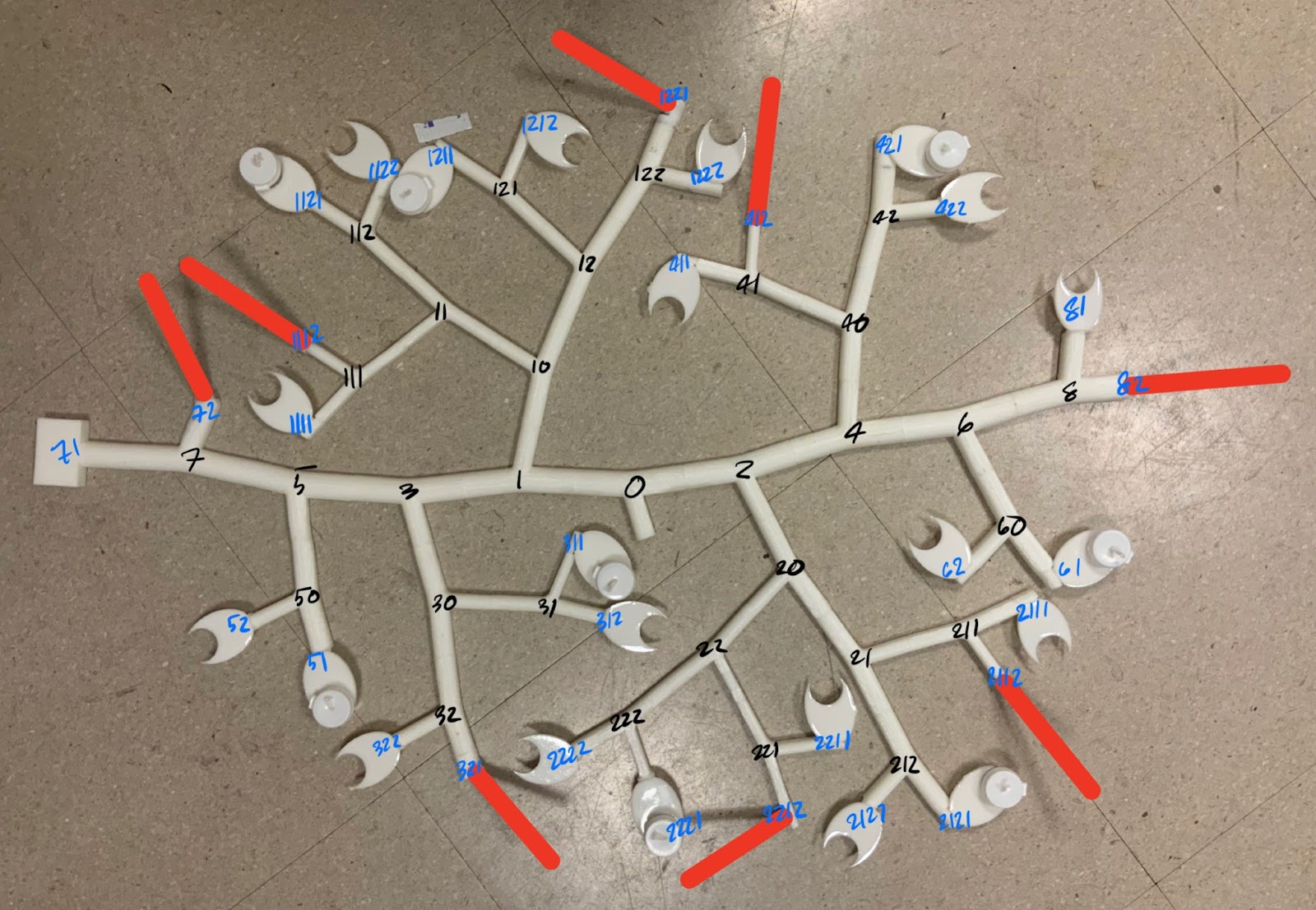
[1] The physical tree structure that we are using for our experiments with annotations. Black numbers are junction names, blue numbers are terminal names, and red bars are the location of nests.
First, nodes along the central branch are numbered in increasing order as they move outwards from the starting node marked “0”, odd numbers on the left and even on the right. This carried through into the rest of the tree with each node further from the branch getting an extra digit, odd if a left turn and even if a right. For us, this made intuitive sense because we could quickly visualize how far different nodes were from the main branch just by looking at their number. This also means we can easily tell if a node is closer towards or further away from the trunk which is a variable we are looking for within the ant’s behavior.
However, that can be very annoying without said visual.
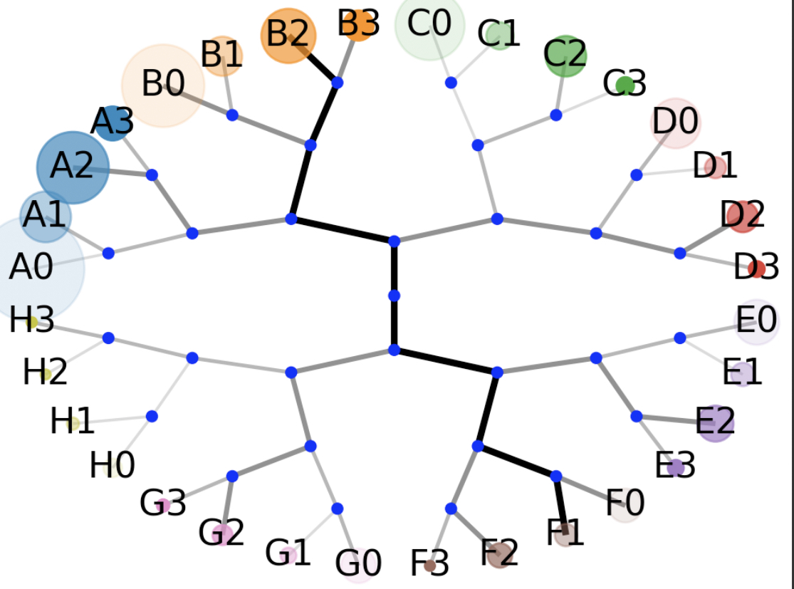
[2] The computer model of the tree above. End points are grouped by letters denoting sets of four points anchored to the same grandparent node, then by numbers in increasing order rotating clockwise. Blue dots are internal junctions, and the thick black line is the central branch. The size of the circles at the end of each end point represent the number of ants that went to the end points in this given run of the code.
For the modeling team, it made far more sense to look at just the ends and visualize the model moving clockwise with letters denoting the node grouping and numbers denoting where in the clockwise direction they were within their node. This naming scheme makes a lot of sense for this task! Because we are abstracting away the tree’s physical shape into a collection of junctions, we do not need to base our naming scheme on said shape. Because the goal of the model is to determine which endpoints the ants visit most, it made sense to label only the tips — not the internal junctions. But it is not readily clear, at least at first viewing, where 72 is on this chart, or where C2 is on the other.

[3] The physical tree structure but annotated with the numbers and borders originally used by the computer vision program.
Meanwhile, the computer vision team replaced the first naming scheme with numbers in ascending order due to the way in which the junctions were detected and ignored the tips because they were not relevant to tracking the ants’ pathmaking.
So, each team was, in a way, using their own language — almost like describing a scene in Spanish versus Zulu while needing to rely on a translation book (or reference image in our case). There’s more to it as well, however, because teams had different ways of understanding the model as well. Even with a reference image and repeated use, a scheme that was intuitive for one person was not for another, and vice versa.
This is a trend that extends beyond just naming schemes and into all designs. UX, architecture, urban planning — all of these rely on many people interacting with the same interfaces. And just like with naming schemes, assumptions and different backgrounds can interfere with everyone having smooth experiences with design. As the UX Collective writes:
Things are never inherently intuitive. Because our brains have different expectations, what feels intuitive for you may feel alien to someone else. Things will only be just as intuitive for your user if they have had similar experiences to you.
This also recognizes that people have different assumptions depending on their environment and the tools they are using. If that’s the case, then would it actually make more sense to optimize each team’s naming scheme for the tools they are using? After all, if our brains are prioritizing different inputs and patterns — say, focusing on the internals of the tree versus just the exterior — there might not be an optimal scheme that accommodates all of them.
At the same time, this tension prompted us to examine how we designed “reference images” like those above. Text is hard to read, colors are jumbled and without explanation — this can do more to overwhelm and confuse the reader rather than aiding them in understanding the geometry of the tree.
This is especially true with incorporating accessibility and localization into our designs. Things such as small text size, low contrast level, relying on colors alone to communicate information, or relying on basic translations rather than utilizing context can make what the designer might think of as being easy to comprehend exceptionally difficult. For example, when designing a key explaining the different types of endpoints on our tree, we do not want to use colors alone as this would make the design less accessible for those who are colorblind. Therefore, we included shapes as well as colors in our key, making it easily digestible and accessible to a wider audience.

[4] An annotated version of the physical tree structure with the nests and food platforms attached. The different colors and accompanying shapes denote which type of nest or food platform the end point hosts.
There are additional things designers can include to make their work more accessible. On the web, this might include keeping important information fixed rather than letting it disappear as well as highlighting (also called “focusing”) text boxes when selected and creating reasonable “tab order” such that when using the tab button, the selected input will follow the visual flow of the page. And when creating academic posters, using high contrast colors for text, large font sizes, and enough space between different paragraphs and sections goes a long way.
So, how did we resolve our naming scheme schism? In the end, we decided it made more sense for each group to use the naming scheme that worked best for them — and we got used to the differences.
Images:
All images by the author
Further Reading:
- Ferreira, Alberto. Universal UX Design: Building Multicultural User Experience. Netherlands, Elsevier Science, 2016.
- Khovaeva, Anastasia et al. “7 Localization Issues Designers Face And How To Solve Them”. Lokalise Blog, 2021, https://lokalise.com/blog/localization-issues-designers/.
No comments:
Post a Comment